views
The US Department of State on Wednesday announced phasing out of the font ‘Times New Roman’ in all official communications in favour of ‘Calibri’, citing issues related to “issues for individuals with disabilities.”
In a statement issued by US Secretary of State Antony Blinken, department employees were informed of the change with the subject, “The Times (New Roman) Are a-Changing,” according to a tweet by The Washington Post reporter John Hudson.
big news for font freaks: Times New Roman is being phased out at the State Department & replaced by Calibri. Secretary Blinken sent a cable to all embassies today directing staff not to send him any more papers with Times New Roman. Subject: "The Times (New Roman) are a-Changin" pic.twitter.com/HENLbRH3UQ— John Hudson (@John_Hudson) January 17, 2023
“Secretary Blinken has directed the Department to adopt Calibri, a Sans Serif font in 14-point font, for all paper submitted to the Executive Secretariat,” the statement read.
Calling for a phasing out of the popular font from February 6, it orders “domestic offices and bureaus, as well as posts overseas, also should adopt Calibri as the standard font for all requested paper in support of creating a more accessible Department.”
Hudson further stated that the change was not due to aesthetics but due to issues for individuals with disabilities. “Apparently the change was made because fonts with serifs create “issues for individuals with disabilities,” per the cable i obtained,” he added.
New Serif in Town
Calibri, a digital sans-serif typeface, which had been the default font for Microsoft since 2007 as it replaced Times New Roman, was replaced across Microsoft Office on 2021.
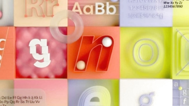
In 2021, Microsoft commissioned five original, custom fonts to eventually replace Calibri as the default, these were: Tenorite, Bierstadt, Skeena, Seaford, and Grandview.
Announcing the decision in 2021, Microsoft had explained: “A default font is often the first impression we make; it’s the visual identity we present to other people via our resumes, documents, or emails. And just as people and the world around us age and grow, so too should our modes of expression.”
The recent US State Department’s decision is a major shift after 20 years and goes back to its big jump from serif typefaces to sans serif, a shift that began in 2004 when Times New Roman 14 emerged as the “new” font on the scene, replacing Courier New 12.
According to an Entrepreneur report, the popularisation of Serif fonts is also linked to accessibility issues for people with disabilities who use Optical Character Recognition technology or screen readers.
Calibri’s designer, Lucas de Groot created Calibri in the early 2000s as part of a collection of fonts for enhanced screen reading, according to The Wired.
After Microsoft launched its ClearType technology in 2000s, which optimised resolutions on LCD screens, fonts such as Calibri made texts easier to read.
What About Times New Roman?
Times New Roman was created by the British typographer Stanley Morison for the Times of London in 1932, according to the New York Public Library.
Read all the Latest Tech News here


Comments
0 comment