views
Wikipedia has been a constant source of sometimes-debated information over close to two decades now. For anyone growing up in the ‘90s, Wikipedia was one of the most accessed websites for the better part of the new millennium’s first decade. This held true at least until the bigger internet boom came along, and brought with it the mobile-first internet generation. Now, after seeing its crucial importance being shared by a wider range of information sources, the non-profit open information source has announced that it is working on updating its desktop site’s ageing design – bringing it up to speed with the hyper-connected, mobile-first internet generation.
Olga Vasileva, lead product manager at the Wikimedia Foundation, the non-profit holding arm of Wikipedia, states, “While Wikipedia’s content has grown rapidly, our interface has not kept pace. We’re proud that our website is more direct, simple, and advertisement-free than the rest of the internet. Yet, the design of desktop Wikipedia and other Wikimedia Foundation projects have not seen any substantive changes for the past 10 years, leaving certain elements of the site’s navigation feeling clunky and overwhelming to readers and editors whose main purpose is to create, learn, and curate content.”
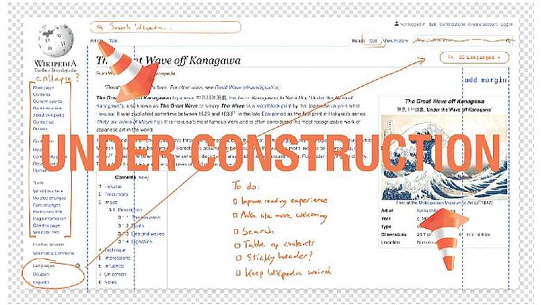
Acknowledging that the overall design of Wikipedia may not be the most intuitive to read, especially for new and first-time internet users, Vasileva says that the new desktop site design is set to become responsive to adapt to the wide range of screen sizes. Among its key redesign features include a reconfigured logo at the top-left corner of the page, a fully collapsible sidebar to reduce excess information on pages, reducing the maximum width of each line to improve readability, a relocated search bar, improved search functionality, seamless one-click language switching, a user menu including the all-popular ‘Dark Mode’, a ‘more information’ tab for articles, and more.
Each of these features will aim to make Wikipedia a more approachable website. Conceived nearly two decades ago, Wikipedia’s present design is still based on the desktop internet era. While Wikipedia has given a glimpse of how each of the new elements would appear like, it is yet to publish a prototype view of all the elements taken together. However, based on what the general design shows, it is mostly an incremental update that aims to add responsive elements to Wikipedia’s pages, instead of overhauling the entire website.


Comments
0 comment