
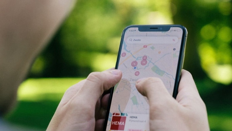
If you have used Google Maps recently, you might have noticed the colours on the interface changed, in fact, look rather cold. And you’re not alone to observe these changes. Google Maps has been given a new update which comes loaded with a change in the colours for roads, water, land and more.
When you browse through the app next time, you will notice the roads are now grey, the colour of water on Maps is now teal instead of blue and even the colour of parks and forest has been changed. You also will notice the colour of traffic for navigation now has brighter reds and blues, which wasn’t the case a few days back. All these changes have clearly not gone down well with the users who now feel these colours make the Apple Maps look much better, even if feature-wise Google has the upperhand even today.
But the most staggering vote of dislike comes via Elizabeth Laraki, who is credited with designing Google Maps interface back in 2007 when the product was about to launch. Laraki pointed out in her post this week that the changes in Google Maps makes it feel less human, less accurate and cold. Even the parks and colour of water is identical which might not be a problem but surely not a well versed UI decision from the team at Maps handling these changes.
15 years ago, I helped design Google Maps.I still use it everyday.
Last week, the team dramatically changed the map’s visual design.
I don’t love it.
It feels colder, less accurate and less human.
But more importantly, they missed a key opportunity to… pic.twitter.com/HMcpKiOEdr
— Elizabeth Laraki (@elizlaraki) November 22, 2023
She does admit that brightening up the major roads and traffic make it easy to read but the overall changes have been criticised and it is likely that drastic changes like these tend to take time with people, and gradually they might start liking or at least accept the new colour tones.
Laraki also mentioned the need to simplify the interface of Maps rather than crowding the screen with umpteen services which might not be needed for users all the time. She said that tags like restaurant, hotels and gas station (petrol pump) can be packed into the bottom bar which can have the features hidden from the main screen of Maps.
She does agree that features evolve over time but as a UI designer, she realises the need to clean them regularly and not complicate the app and the interface for the users. People in countries like the US have actually jumped ship to Apple Maps which might have been unthinkable a few years back.
For those in India, they have alternatives like MapMyIndia that seems to optimise the platform with localised needs like helping people climb an overhead road or a flyover, and assist them with roads that might be closed or barricaded.


Comments
0 comment