views
New York: Even as Microsoft prepares for a future dominated by touch-screen devices, it is steering its Windows system to embrace more of the past.
The divide between old and new is less pronounced in the latest, free update. That's a welcome change, as that's one of the things that annoy me most about Windows 8.
As sales of smartphones and tablets grow rapidly, Microsoft reshaped Windows so that PCs came to look, work and feel more like mobile devices.
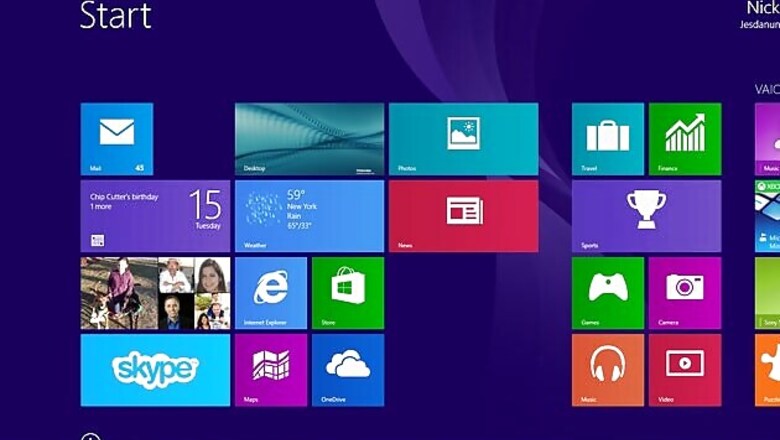
Windows 8 has a full-page, tablet-like start screen filled with large icons, or tiles. Traditional mouse and keyboard controls still work, but it's more efficient if you use touch-screen controls. Windows 8 has a desktop mode that resembles older versions of Windows, but it steers users toward the touch-centric tile mode.
Many people hated Windows 8 when it came out in October 2012.
Microsoft responded a year later with Windows 8.1. With the free update, people can change settings to boot computers directly into the desktop. Windows 8.1 restores a Start button on the lower left corner of the desktop, though without all the functionality found in older versions. Windows 8.1 also lets people add their favourite desktop apps to a horizontal taskbar at the bottom of the screen.
In short, Windows 8.1 doesn't try to force people into the tile screen as often.
Still, Windows 8.1 feels like two separate systems. Your favorite desktop apps are on the desktop's horizontal taskbar, while your favorite tile-mode apps are on the tile-based start screen. How you perform tasks such as closing an app depends on which mode you're in.
Last week's update, simply called Windows 8.1 Update, brings more consistency:
- The tile screen now has prominent buttons for key controls - namely search and shutting down. No longer do you have to figure out how to pull those options out like a sock drawer from the right side of the screen. Microsoft could have gone further by also including a button for settings, but I'm getting greedy.
- Closing apps in the tile mode used to require moving your cursor to the top, clicking the mouse or pressing the screen until the app shrinks and dragging all that to the bottom. Gone was the "x" at the top right of all apps to close them.
That "x" is back, along with a button to minimize, or hide, the app while leaving it running. Unlike past versions of Windows, these buttons at the top disappear until you move the cursor to the top. The good news is this works whether you're in desktop or tile mode, contributing to consistency.
- That desktop taskbar at the bottom now accepts your favourite tile-based apps as well. You're no longer left with some of your favourites in one place, and the rest in another. And the taskbar now appears when you're in tile mode, too, though it's hidden until you move the cursor to the bottom.
- By default, laptops and desktops boot to the desktop mode, without a setting change required on your part. Tablets still go to the tile-based start screen more fitting for tablets.
- Opening a photo, music or video file in the desktop no longer takes you to a tile-based app. You stay in the desktop and use desktop versions of the apps instead. And closing a tile-based app now brings you to the previously used app, not automatically to the tile-based start screen.
These tweaks, though small, are significant when considered on the whole. It's as though Microsoft is acknowledging that tablet-style controls aren't always best for PCs, especially those without touch screens.
In unveiling the update, Microsoft also hinted at a future that embraces even more of the past:
- Even with the update, you're restricted to two to four tile apps on the same screen. You can decide how much horizontal space each app takes, but you can't adjust the vertical space or have an app overlap over part of another.
Microsoft promises that in a future update, you'll be able to run tile apps as regular windows in the desktop mode. As long as you stay in the desktop, there would no longer be a distinction between the two types of apps.
- Clicking on that restored Start button in the desktop now takes you to the tile-based start screen. You can't open apps or access settings from that button, the way you could with previous versions of Windows. In a future update, you'll be able to do that.
Microsoft hasn't said when the next version will come out, but that preview and last week's update together show that Microsoft is listening to customers.
Many people have resisted buying a Windows computer because of the abrupt changes Windows 8 forces on users. The latest changes will give potential buyers fewer reasons to resist.
How to get it:
Windows 8.1 Update is a free download.
If you already have Windows 8.1, you can go to "Update and recovery" in the settings. It will come automatically if you subscribe to automatic updates.
If you have Windows 8, you must upgrade to 8.1 first. It's a free update through the Windows Store.











Comments
0 comment