views
Narrowing Down Your Topic
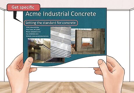
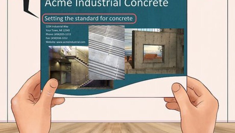
Get specific. A brochure is a valuable, tangible piece of marketing material that is ultimately used to sell. Unlike a website, you have a limited amount of space on which to provide information. When writing a brochure be specific with what you are selling. Don’t try to cover too many topics in one brochure. While a brochure can be used to highlight your overall offerings, it's often good to have multiple brochures. You should have a brochure for each individual product or service. For example, if you’re a company that builds beautiful custom rooms in people’s homes, like kitchens, bathrooms, living rooms, you may have more success in your brochure if you only cover one room. Instead of offering a lot of broad information, you want your brochure to focus on one topic. Perhaps you write one brochure on only kitchens. Get specific to one room so you can explain every detail from the type of tile you offer to the colors of the cabinet handles.
Put yourself in your readers’ shoes. Pretend you’ve come across your own brochure. When looking at the front ask yourself what kind of information you would want to find inside. Write down and answer any questions you may have. You can use these in your brochure. Identify your target audience. You want to think about where people will pick up this brochure. Who these people are. Are you writing your brochure to an individual consumer who is looking for a product or service? Or are you writing your brochure for a team of investors and board members? Your voice and tone and even the information you provide will be different based on who is going to be reading your brochure. If you’re writing about all the ways you can customize a kitchen to a potential customer, your tone may be more lighthearted and include more lifestyle information. Include info for options on materials and different builds. Focus on how what you offer will make your customers feel. You want to create content that the benefits you can provide. If you’re writing to more of a corporate crowd, or in a B2B (business to business) setting, you might want to include more hard facts and numbers. Focus on information that shows investors or other businesses how your product will have a positive monetary impact.
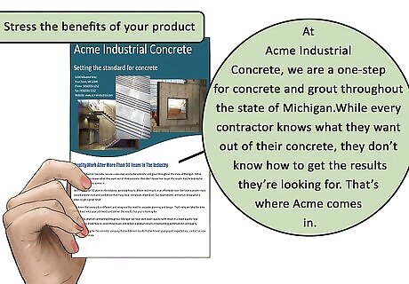
Stress the benefits of your product. Instead of just providing an overview of the basic features, you want to focus on a specific topic that lets you get detailed. Features describe the product or service; benefits describe how the features will help the reader. Consider including an FAQ section of common questions that you’ve gotten before and provide answers. Your brochure is a product someone will take away. Therefore, you need to provide enough relevant information quickly and effectively. Your brochure will serve as a salesperson of sorts.
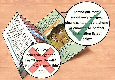
Exclude any information that’s not relevant. You won’t be able to fit everything you might want to say into one brochure. Since you have limited space, it’s important to remember that not all your information is relevant. Leave out information that doesn’t directly impact the main product or service. Leaving out information doesn’t necessarily mean leaving out core marketing materials. You should still include your company’s logo or image, a blurb about the company, and a section on where to find more information and who to contact. For example, if you are writing a brochure on designing custom kitchens, you don’t need information on what you can do in other rooms. You may simply want to include in your about section the other rooms you offer. Don’t waste space going into detail on those rooms in this brochure.
Setting Up a Layout
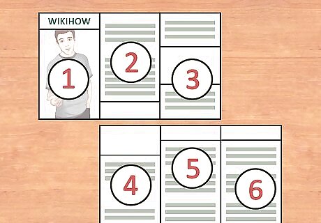
Choose a layout. Brochures come in many styles and layouts. The most common is the tri-fold brochure. However, you should free to choose a different layout depending on the information you are providing. Now that you have a topic narrowed down, you can begin writing copy. Pay attention to how many sections you need. Create an outline to help you discover how much room you'll need. In a typical tri-fold brochure, a piece of landscape paper is divided into 6 sections. Sections 2, 3, and 4 are your inside sections and usually contain the most valuable information. Section 2 is the inside flap and usually contains broad information with questions and answers. This information compels the reader to believe that the product will be the answer to any problems the reader has. Sections 3, and 4 typically expand and go deeper. These sections explain the information, affirming the reader that a solution is contained within your brochure. Section 1 is the front cover. This area entices readers to pick up your brochure. It often depicts an image that conjures up positive feelings. The aim of your front flap is to make the reader open your brochure. There should also be a line or two of copy that promises the reader a benefit. Section 5 is the back flap and usually contains testimonials and coupons. Section 6, which is the middle back third, usually contains contact information like a phone number, website, and map. There are plenty of folding types and layouts when it comes to brochures. Some brochures are more like books or pamphlets. Some include inserts or cutouts. Don’t feel like your brochure has to be a typical tri-fold. The organization of information is essentially the same whatever your layout. The front is used to depict a lifestyle that can be achieved by the product or service within the brochure. The next pages contain answers and offers. And the last sections provide incentives to move forward and contact information.
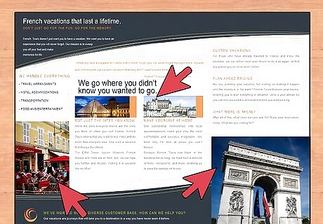
Capitalize your real estate. Whatever style or layout you choose, you need to make the most of the physical space. This means finding a balance between words and images. While your copy provides readers with valuable information, you don’t want to fill entire pages or sections with blocks of text. No one will read your brochures if you write too much. This is where pictures and graphs help you. Don’t make your text size smaller to accommodate more words. If you can’t fit what you want to say on a page or section, you’re saying too much. Pictures and graphs are a great visual way to provide valuable information. You can also include little blurbs of text that explain a photo or graph.
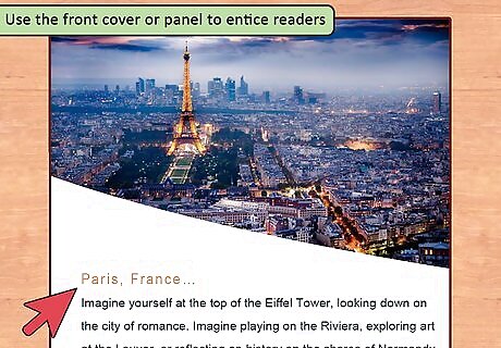
Use the front cover or panel to entice readers. Your front cover is what will get people to pick up your brochure. An eye-catching photo or graphic is more effective than a bunch of text. Use a photo that showcases the product or service you are selling. Depict people enjoying your products or services. Along with a great photo, be sure to include text that speaks directly to the reader. Ask a question or state a benefit that someone picking up your brochure will want. A tagline and a line or two of text on your cover give readers enough information to pick up your brochure. It also creates just enough mystery to entice readers to flip to the next page or section.
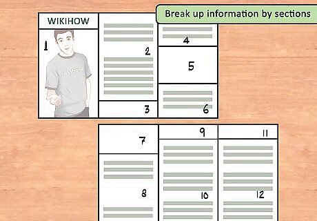
Break up information by sections. On the inner panels, use headings to break up long blocks of text. Brochures have limited space and you don’t want to use up all the space with long blocks of text. Too much text looks intimidating to the reader. Instead of long paragraphs or sections, keep sections and sentences short. Bulleted or numbered lists further separate the text and make information easy to digest. These elements will also bring the readers’ eyes into the brochure. Use bold headers to separate sections and break up your brochure. Provide different types of content and information for different sections. If you talk about appliances in one section of your custom built kitchen brochure, use another panel or section to showcase another aspect of your offerings like lighting or cabinets. Breaking up your brochure into sections allows readers to compartmentalize information. Sections help the flow of information and keep readers interested without getting overwhelmed.
Creating the Content
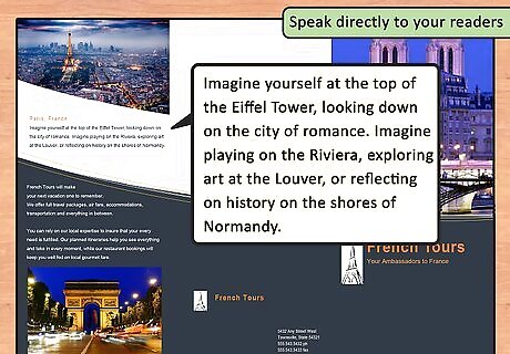
Speak directly to your readers. Address the reader as “you” to establish a relationship with the reader. Making your copy personal creates a relationship between you and your customer. Talking directly to the reader as an intelligent person will help to keep your potential customers interested. Your brochure should begin and end with your customer. Before you get into the meat of your brochure explaining all the great things you offer, you should entice your customer by answering questions and overcoming potential objections. Focus your content on providing information which sells your features through benefits. Cite real-world examples or case studies. Aim to answer the question of how your customer will benefit from your product or service.
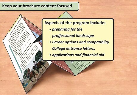
Keep your brochure content focused. Your goal is to keep earning your reader’s focus and attention. Cater your content to the type of reader you are hoping to attract with your brochure. If you’re writing a brochure to generate leads include info that prospects don’t know about your company. Give a brief blurb on the history of your company and why you are different and better than the competition. However, if your brochure is a sales closer your customers already know your company’s history. Don’t bore readers with information that gives a potential customer a reason to stop continuing on to the next section. Keep the content relevant to your brochure’s purpose. But also brief enough to not run out your reader's interest. Your content should highlight the benefits of what you are offering, not just features. Instead of only providing content that shows your product, include a lifestyle atmosphere. Show how your product will benefit your customer’s life. You can do this with pictures and copy that show people enjoying your product. Explain why current customers are satisfied. Leave boring specifics out. In your brochure, your readers don’t need to know right away every small detail of how you build a custom kitchen. Your readers will benefit more from how your premiere craftsmanship and design expertise creates reliable products and the right atmosphere.
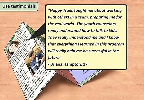
Use testimonials. Get quotes from satisfied customers to include in the brochure. Be sure to include the customer’s full name, as well as any other relevant information that helps to make the testimonial seem legitimate. Testimonials are a great way to further provide potential customers with a reason to keep reading. They also back up the lifestyle and solutions you are promising throughout your brochure.
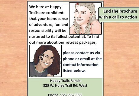
End the brochure with a call to action. Direct your reader to the next step. This could be done by asking your reader to visit your showroom or call your office to schedule an appointment. Try to create an emotional call to action. Once again, consider using words and pictures to elicit an emotion. People are more likely to act if you can create empathy. If your brochure is selling custom kitchens, use a picture that shows a happy family sharing a delicious meal in a beautiful kitchen. Then, in your call to action, invite readers to contact you to get a kitchen that will make every night as perfect as the one in your photo.









Comments
0 comment