
views
Creating a Familiar Look

Recognize that editors prefer simplicity, familiarity, and consistency. Editors have huge piles of submitted manuscripts — well, nowadays, perhaps countless email attachments — to read through at any one time. You might think that flashy colors, unique fonts, or some other eye-catching effort might make your manuscript stand out, but they usually prefer a “boring” standardized look that allows them to quickly examine and assess the work. For each publisher to which you submit your manuscript, check to see if they have specific formatting guidelines, and follow them if so. Guidelines will often be posted on the publisher's website, but if you aren't sure, you can contact a person in the acquisitions department for clarification. In absence of publisher guidelines, however, using the general guidelines here should work. Usually, if your formatting is common, simple, and consistent, your manuscript’s odds of immediately landing on the “reject” pile will be reduced.
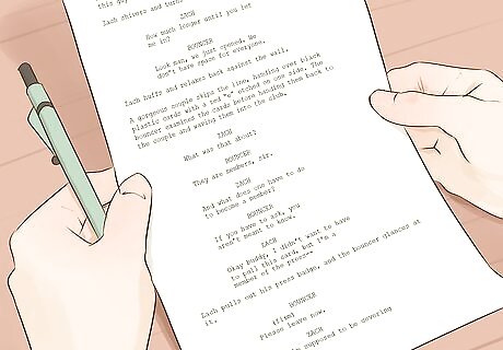
Accept that there is no single “Standard Manuscript Format.” This is true despite the fact that editors and publishers regularly use the term, or even abbreviate it as “SMF.” Instead of a single, clearly-defined, universal standard, what exists instead are a set of generally-agreed upon formatting principles with variations on the specific details. If you don’t have specific formatting guidance from your prospective publisher, don’t drive yourself crazy trying to find the one true “SMF.” Pick and stick with the variations you find most sensible throughout your manuscript.
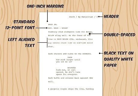
Get the basics correct. Despite the SMF being akin to the Loch Ness Monster or Bigfoot — rumored but never proven to exist — there are some formatting guidelines that are practically universal and should always be followed. Use all black text on all white paper. No funky, unique, or "pretty" colors of any kind. Also use a good-quality, 20-pound bond white paper if making a hard copy submission. Don’t staple the paper, and pack it neatly and securely for shipping. Make the manuscript readable by choosing a traditional, 12-point font and double-spacing everything. No big letters, no cramped pages to save trees / shipping costs, no Comic Sans font. There is some disagreement on the best traditional font, but Times New Roman, Courier, and possibly Arial are the best bets. Create margins that allow the editor room to scribble notes on the pages. One-inch (2.54 cm, or just 3 cm) margins all around is the typical standard. You can go a bit bigger if desired, but there is no reason to have giant margins and a small text area in the center. Every page of text should have a header with your last name, the manuscript title (or just key words from it), and the page number. Commonly this is placed on the right margin. Some recommend using hyphens or spaces, but slashes are typical as such: Smith / My Manuscript / 23. Unless told otherwise, left align your text, leaving a jagged right edge (don’t “justify” the text). This is considered more readable by most. If you're submitting electronically, save your manuscript as a PDF unless specifically told otherwise. This format is easily readable by anyone with a computer and will preserve your formatting exactly.
Following Your “Standard Manuscript Format”
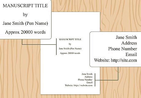
Lay out the title page. While some editors advise using a combined title page / first text page, especially if submitting a short story, creating a separate title page is probably the safe option. At very least, your title page needs to have your full name (legal name and pseudonym, if used), the full title of the work, your contact information, and a word count (actual or close estimate). Consider the following layout for your page (all double spaced): Place your legal name and contact information on the top left of the page. Place your word count on the top right. With the ease of modern word processors, there is no reason not to include the precise word count instead of an estimate. Halfway down the page and centered, place your title in all caps. On the next line (centered), add “by.” On the line after that, add your name or pseudonym as you want it to appear on the work. In the bottom section of the page, you may choose to add copyright information and / or contact information for you or your agent, if either is relevant to your manuscript.
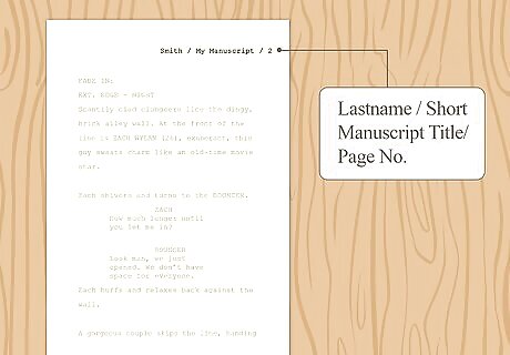
Format your header. Despite some slight variations in style, experts invariably recommend that you include as a header your last name, the title (or abbreviated title), and the page number along the top right of each page of the manuscript text. The following would make a clean, simple header: Lastname / My Manuscript / 1. If your title happened to be “My Totally Awesome, Must-Read, Must-Publish Manuscript,” then “My Manuscript” would make a good abbreviation for the header. Your title page should not have a header nor a page number (think of it as page zero). Other possible prefatory materials (contents, acknowledgements, etc.) are also not part of the main page count, and can instead contain a header that uses lowercase Roman numerals (for example, Lastname / My Manuscript / iii). The page indicated by Arabic numeral one (1) marks the beginning of the actual manuscript text.
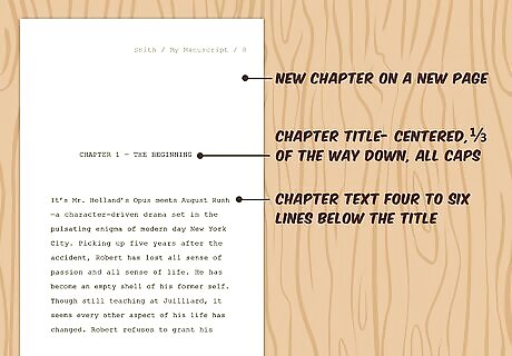
Make new chapters clearly identifiable. Editors do not want to have to search for (or guess) where one chapter ends and another begins. Start each chapter on a new page. Leave the top third of the new page blank, save for the header. One-third of the way down the page, centered, enter the chapter number and chapter title in all caps; for instance: CHAPTER 1 — THE BEGINNING. Start the text of the chapter four to six lines (two or three double-spaced lines) below the title. Do not indent the beginning of the first paragraph in each chapter. Only paragraphs that begin a new, separate chapter, section, etc., after a break with the last part of the text, should appear without indentation. All lines of dialogue should be indented, unless they begin a chapter, etc. Advice on the actual indentation varies, with some advising five spaces and others one-half inch or 1.25 cm. Consistency throughout the manuscript is probably most important.
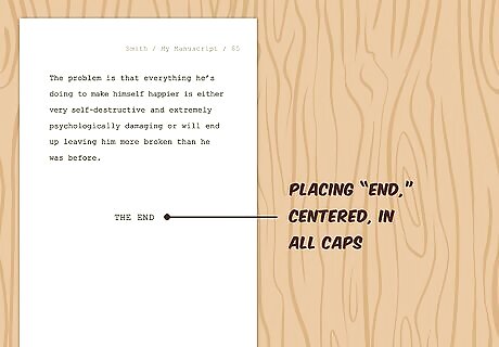
Address other possible components of your manuscript. Once again, consistency and clarity should be your goals. Every manuscript has an ending (and hopefully a compelling one), and placing “END,” centered and in all caps, is the best way to clearly indicate the conclusion of the work. In a manuscript that includes scenes, such as a play or movie script, scene breaks can be identified by leaving a blank line, save for a centered hashmark (#). Footnotes are less common in non-academic manuscripts, and as such not as often clearly addressed as part of “SMF.” If you have footnotes, consistency is likely the most vital factor. You should probably only consider using endnotes if you have nothing but citations in your notes.
Formatting with a Sample Word Processor (Google Docs)
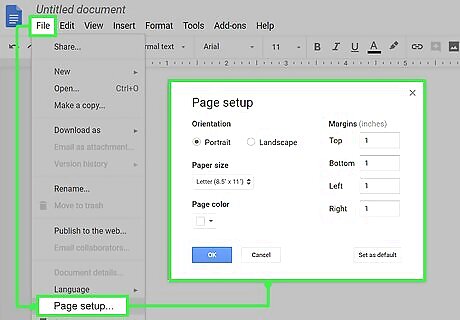
Set up the page. Default margins in Google Docs are already set at the preferred one inch, but if you need to reset them: Click the File tab. In the drop-down, click Page Setup. In the box that appears, enter “1” (inches) for the top, bottom, left, and right margins. The document should already be in portrait mode, not landscape. If not, change it here also.
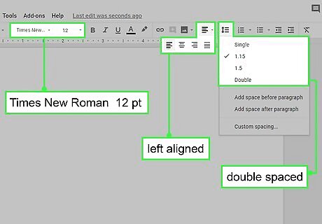
Choose the proper alignment, spacing, font type, and font size. All of these can be changed by clicking on the proper buttons across the top section of the page. The default text type and size in Google Docs is Arial 11-point, so these should be changed. The preferred left alignment (with a jagged right edge) is the default, but the four alignment option buttons (left, right, center, justified) are easily located near the center of the row. The line spacing button is just to the right of the four alignment buttons. 1.15-line spacing is the default in Google Docs. Simply click the button and choose “Double” from the drop-down. The font type and size buttons are also easily located in the left-center part of the row. Simply click on each to produce drop-downs with your font style and size options. Always choose 12-point, and it is usually best to use Times New Roman unless otherwise directed.
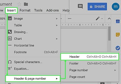
Set up your header. Remember that your header should include your last name, (abbreviated) title, and page number, and be located at the top right of each page of the main body of the text. The title page should not have a header nor be included in the page number sequence. Click the Insert tab. Choose “Page Number” from the drop-down. Four options will appear. Select the one that places the page number in the top right corner, but excludes the title page (as indicated by a small animation of two sample pages). Page headers are not shown unless you are in Print View mode. This option is found under the View tab. Find the first inserted page number (“1”). Place the cursor to its left, then type your header as such: Lastname / Abbreviated Title / 1. Click below the dotted line to return to the main body of the text.





Comments
0 comment