
views

Launch the Microsoft Excel application.
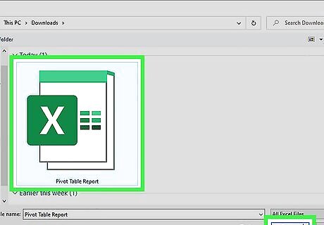
Browse to, and open, the file containing the pivot table and source data from which you want to create a chart.

Decide on the statement you want your pivot chart to represent. This decision will determine how you craft your pivot chart. The style of the chart and the columns that are used will depend on this one statement of conclusion. For instance, a bar chart is useful for representing the data under differing conditions, such as sales per region, while a pie chart can be used to display percentages or portions of a whole.
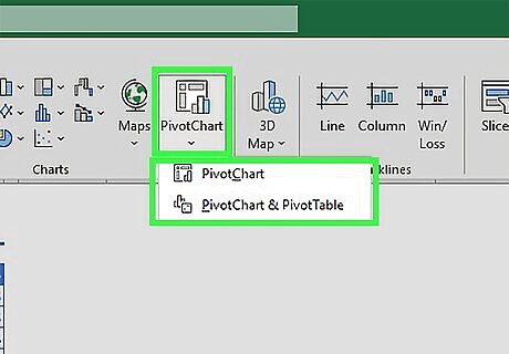
Locate and launch the Pivot Chart wizard. In Excel 2003, this will be under the "Data" menu. In Excel 2007 and 2010, you will find this on the "Insert" tab.
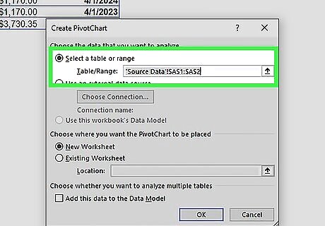
Set the range for your pivot chart. It should be the same range used for the related pivot table.
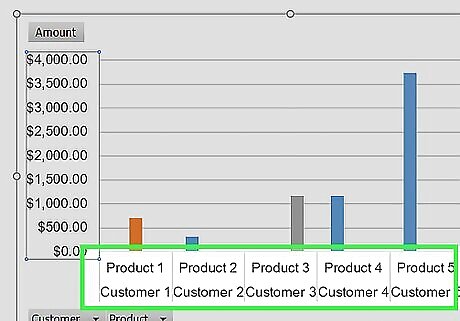
Drag one column label representing the "x" axis of the chart and drop it into the "Axis Field" section of the Pivot Table Field List.
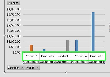
Choose the column label containing the data you want to display by the "x" axis field and drag it into the "Values" section of the Pivot Table Field List. For instance, if your source data is a spreadsheet of sales by product and customer name, you may choose to drop either the customer name or the product column label into the "Axis Field" section. You would drag the column label for the sales amounts into the "Values" section.
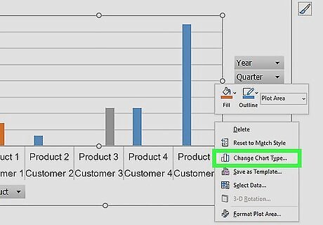
Alter the chart type by right-clicking on the chart background area and choosing "Change Chart Type" from the pop up menu. Try a few different chart types until you find the type that best represents the point you want to make.
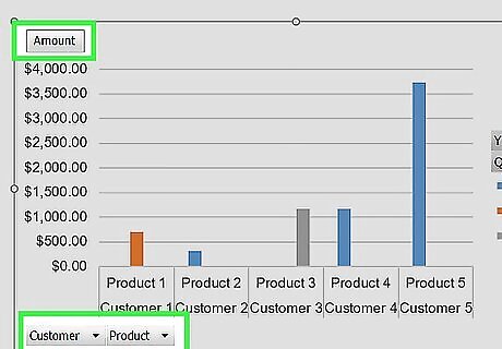
Add data labels, axis titles and other information to your chart by right-clicking the relevant portion of the chart and choosing the options from the menu.
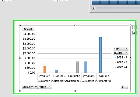
Move your pivot chart anywhere in the workbook file you like. It can be placed in one corner of the source data sheet, on the same tab as the pivot table or on its own tab.


Comments
0 comment