views
Basic Cumulative Frequency
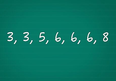
Sort the data set. A "data set" is just the group of numbers you are studying. Sort these values in order from smallest to largest. Example: Your data set lists the number of books each student has read in the last month. After sorting, this is the data set: 3, 3, 5, 6, 6, 6, 8.
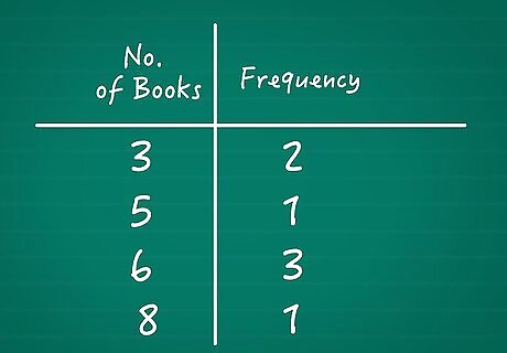
Count the absolute frequency of each value. The frequency of a value is the number of times that value appears. (You can call this the "absolute frequency" when you need to avoid confusion with cumulative frequency.) The easiest way to keep track of it is to start a chart. Write "Value" (or a description of what the value measures) at the beginning of the first column. Write "Frequency" at the top of the second column. Fill out the chart for each value. Example: Write "Number of Books" at the top of the first column. Write "Frequency" at the top of the second column. In the second row, write the first value under Number of Books: 3. Count the number of 3s in your data set. Since there are two 3s, write 2 underneath Frequency on the same row. Repeat for each value until you have the full chart: 3 | F = 2 5 | F = 1 6 | F = 3 8 | F = 1
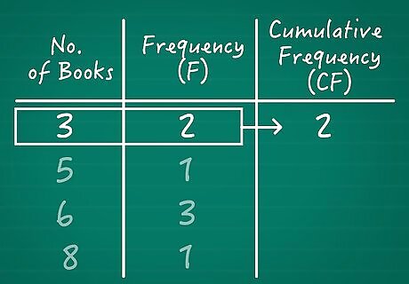
Find the cumulative frequency of the first value. The cumulative frequency answers the question "how many times does this value or a smaller value show up?" Always start with the lowest value in your data set. Since there are no smaller values, the answer is the same as that value's absolute frequency. Example: Our lowest value is 3. The number of students who read 3 books is 2. No one read fewer than that, so the cumulative frequency is 2. Add it to the first row of your chart: 3 | F = 2 | CF=2
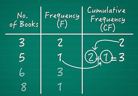
Find the next value's cumulative frequency. Move to the next value on your chart. We just found how many times the lower values showed up. To find the cumulative frequency of this value, we just need to add its absolute frequency to the running total. In other words, take the last cumulative frequency you found, then add this value's absolute frequency. Example: 3 | F = 2 | CF = 2 5 | F = 1 | CF = 2+1 = 3
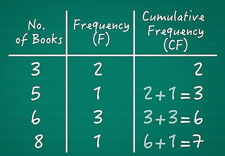
Repeat for the remaining values. Keep moving to larger and larger values. Each time, add the last cumulative frequency to the next value's absolute frequency. Example: 3 | F = 2 | CF = 2 5 | F = 1 | CF = 2 + 1 = 3 6 | F = 3 | CF = 3 + 3 = 6 8 | F = 1 | CF = 6 + 1 = 7
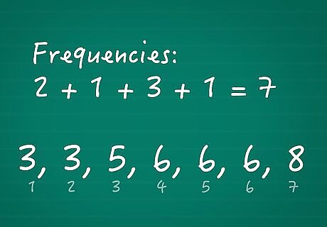
Check your work. Once you're done, you've added together the number of times every variable has appeared. The final cumulative frequency should equal the total number of data points in your set. There are two ways to check this: Add all the individual frequencies together: 2 + 1 + 3 + 1 = 7, which is our final cumulative frequency. Count the number of data points. Our list was 3, 3, 5, 6, 6, 6, 8. There are 7 items, which is our final cumulative frequency.
Advanced Use

Understand discrete and continuous data. Discrete data comes in units you can count, where it's impossible to find part of a unit. Continuous data describes something uncountable, with measurements that could fall anywhere between whatever units you choose. Here are a couple examples: Number of dogs: Discrete. There's no such thing as half a dog. Depth of snow: Continuous. Snow gradually builds up, not in one unit at a time. If you tried to measure it in inches, you might find a snowdrifts that was 5.6 inches deep.
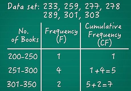
Group continuous data by range. Continuous data sets often have a large number of unique variables. If you tried to use the method above, your chart would be very long, and hard to understand. Instead, make each line of your chart a range of values. It's important to make each range the same size (such as 0—10, 11–20, 21–30, etc.), no matter how many values are in each range. Here's an example of a continuous data set turned into a chart: Data set: 233, 259, 277, 278, 289, 301, 303 Chart (first column value, second column frequency, third column cumulative frequency): 200–250 | 1 | 1 251–300 | 4 | 1 + 4 = 5 301–350 | 2 | 5 + 2 = 7
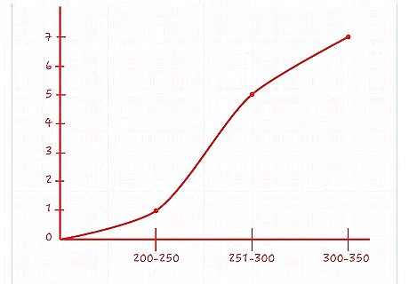
Make a line graph. Once you've calculated cumulative frequency, get out some graph paper. Draw a line graph with the x-axis equal to the values of your data set, and the y-axis equal to the cumulative frequency. This will make the next calculations much easier. For example, if your data set goes from 1 to 8, draw an x-axis with eight units marked on it. At each value on the x-axis, draw a point at the y-value that equals the cumulative frequency at that value. Connect each pair of adjacent points with a line. If there are no data points at a particular value, the absolute frequency is 0. Adding 0 to the last cumulative frequency doesn't change its value, so draw a point at the same y-value as the last value. Because cumulative frequency always increases along with the values, your line graph should always stay steady or go up as it moves to the right. If the line goes down at any point, you might be looking at absolute frequency by mistake.
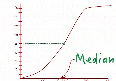
Find the median from the line graph. The median is the value exactly in the middle of the data set. Half of the values are above the median, and half are below. Here's how to find the median on your line graph: Look at the last point on the far right of your graph. Its y-value is the total cumulative frequency, which is the number of points in the data set. Let's say this value is 16 Multiply this value by ½ and find it on the y-axis. In our example, half of 16 is 8. Find 8 on the y-axis. Find the point on the line graph at this y-value. Move your finger from the 8 on the y-axis out across the graph. Stop when your finger touches the line of your graph. This is the point where exactly half of your data points have been counted. Find the x-axis at this point. Move your finger straight down to see the x-axis value. This value is the median of your data set. For example, if this value is 65, then half of your data set is below 65, and half is above 65.
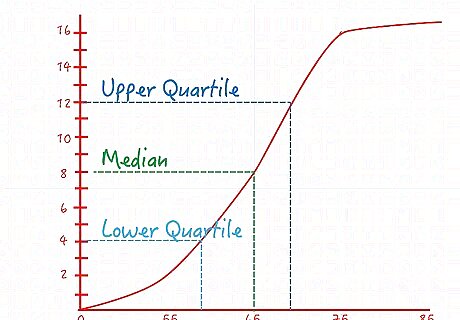
Find the quartiles from the line graph. Quartiles divide the data into four sections. This process is very similar to finding the median. The only difference is how you find the y-values: To find the lower quartile's y-axis value, take the maximum cumulative frequency and multiply by ¼. The corresponding x-value tells you the value with exactly ¼ of the data below it. To find the upper quartile's y-axis value, multiply the maximum cumulative frequency by ¾. The corresponding x-value tells you the value with exactly ¾ of the data below it and ¼ above it.




Comments
0 comment