views
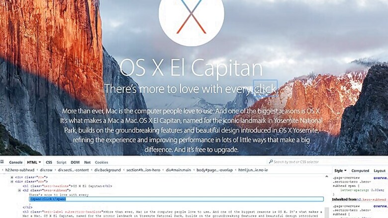
Apple has come a long way from its roots in the counterculture of the 1970s to evolve in the prim and proper multi-billion company it is today. So concerned Apple is about propriety that it has gone to the extent of altering the spacing of the letters of the word 'click' on its website.
There doesn't appear to be any other reasonable explanation behind this other than to prevent people from mistaking the word 'click' for 'dick.' Because if the 'cl' in the word 'click' in the sentence "There's more to love with every click," is confused for a 'd' then the meaning turns vulgar.
This was noticed by a sharp-eyed Twitter user Dan Leech (@bathtype) who says he also tinkers with typefaces.
A peep into the source code of Apple's OS X page, shows that the company has indeed "wrapped a span around the word 'click' to apply more generous letter spacing, so it doesn't look like 'dick.'"

This little GIF animation, that we put together, will make the change in kerning more obvious.


Comments
0 comment