views
Android 12 is still some time away from our phones, but internal development is clearly on in full swing. As the developers and testers await the third Android 12 Developer Preview to release soon, an unreleased beta update has now been spotted by XDA Developers. The update reveals a bunch of interesting new features, including what appears to be shaping up as a major interface overhaul. This will be the main talk of the town, since the overall interface overhaul appears to be a bit polarising in nature.
Android 12 new design
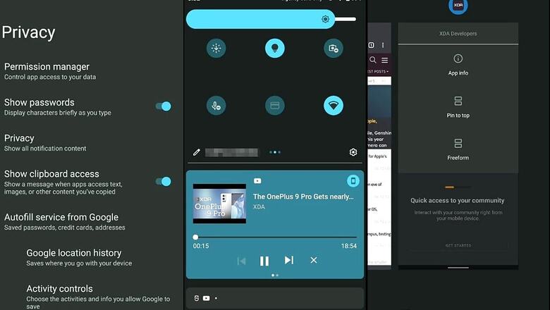
In terms of the overall interface, Android 12 appears be getting large, chunky buttons and sliders for controls such as volume and power, among others. Other new UI items reserved for Android 12 include a key update for tablets, which will, for the first time, get a native dual-panel home screen to make the most of the screen space. Reflecting on the more spaced out icons, the Quick Settings drawer from the notifications panel also seems to follow the same design language with three settings icons per row – instead of the condensed view of five or six icons per row.
Starting with Android 12, every app also appears to get a splash screen (a loading screen with the app logo) when it is opened. The new Android version also appears to get new scrolling effects when you over-scroll, showing a sticky scroll aesthetic that certainly looks better than the menu entries simply stopping abruptly at the end of a list. There is also a smooth, inertial app drawer opening effect, a chunkier brightness slider and also a new charging animation. Finally, Google appears to have decided to rename ‘reduce brightness’ to ‘extra dim’, and while we’re sure it’ll have some specific reason for having done so, we can’t quite say exactly why.
New functional features
Moving on to new features from a usage point of view, Android 12 appears set to get a new, default rolling screenshots tab from the power menu. It also gets a better and easier to adjust splitscreen apps view, and from the quick access panel, the splitscreen view has been renamed to ‘pin to top’. The latter will pin an app of your choice to the upper half of the screen, therefore letting you select a second app to load at the bottom. Google is also making way for users to configure the power button to wake the Google Assistant – something that other OEMs do for a while, and even Apple does with Siri.
There is also a universal search bar within the Android 12 widgets panel, a new set of emojis and slight tweaks to the appearance and ease of configuring Wi-Fi. While the list may not sound much, it certainly makes for a considerable overhaul when put together, and make for refinements that Android users have been asking for a long time.
Privacy improvements
Finally, Google is continuing on the overall streak of privacy improvements that it began with Android 10 and 11. As a result, Android 12 appears set to get new privacy features, such as an icon prompt every time an app accesses your clipboard. The clipboard is a vital field where you may have copied your previous password to, hence restricting the apps that can get away with this permission quietly, in the background.
Android 12 is also improving the way to customise notification permissions, alongside providing a clearer notification prompt, an easier (or rather, more streamlined) way to sideload APKs (this one will be interesting for Google’s antitrust cases), and so on. All things considered, the entire set of improvements that Android 12 new features are set to bring do represent a fair amount of change – both in terms of features and the way the upcoming OS may look.
Read all the Latest News, Breaking News and Coronavirus News here. Follow us on Facebook, Twitter and Telegram.


Comments
0 comment