views
New Delhi: Given the experience on how clueless our politicians seem to be in the matters of technology it always makes news when a politician does something that gives him a semblance of tech-savviness.
Even if you may, or may not, agree with his politics, Narendra Modi's e-initiatives do give him an apparent advantage over other politicians. Half-a-million users follow Modi on Twitter, his blog is regularly updated and so is his Facebook page and YouTube channel. Even though most of the updates that are posted under Modi's name lack the personal touch and therefore a hired hand could very well be posting much of them.
With assembly elections in Gujarat coming closer, Modi has opened yet another channel to reach out - an iOS app for the iPhone and the iPad.
Personally, I do not see much value in having an app for a purpose that can very well be served through a Web browser. But since apps give an appearance of 'happening', everyone is scrambling to get one and so seems Modi. At the same time, having an app does no harm (except that they usually cost some money) and it may attract more users. This is possibly also the thought behind this app.
On the Apple App Store the Narendra Modi app is curiously listed under 'lifestyle'. I know the Apple App Store categories are not all encompassing and it could be a little difficult to slot an app on a personality, but 'news' would've perhaps been a little more appropriate.
The best thing about the Narendra Modi app is that there is a Narendra Modi app. This app elicits a sense of deja vu. I had similar reactions while reviewing the BJP iPhone app. I strongly feel that websites should first work on building a mobile browser friendly website before developing an app, whose only purpose is the be a close of the site in a restricted environment. Also web apps, those may not generate as much buzz, but are also a very viable alternative.
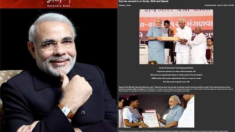
The biggest problem with reviewing such an app is that it is very difficult to sound balanced when so much is wrong about it. The design is lame. The best looking screen is the welcome screen in which a smiling Narendra Modi stares at with a thumb strategically placed on his chin. This says a lot about what you will find inside.
Don't know why some designers pay so little attention to icons. Icons, particularly on an app, are the most tapped on areas on the screen. The news icon on the Modi app looks like more like a QR code and the shuffle icon is used for the media link (is there a hidden message in there?). They also could have at least got the image thumbnail sizes right.
The look of the individual article page resembles a web page whose css file has failed to load. The videos fare better only because it pulls in Narendra Modi's official YouTube channel. The developers of the app cannot claim any credit for this. The video icon is that of the clapboard, again not an appropriate icon to use in this case. The individual photos in the images section do not carry any captions.
The first thing I expected to find on an official Narendra Modi app are his blog posts. But they are nowhere to be found in there. They could've also pulled in his Twitter feed.
You will be thankful for the pinch to zoom feature when reading Modi's biography on the app. The default font size is tiny. Also that the app doesn't seem to have a landscape view, may disappoint some iPad users who prefer to hold their tablet that way.
It is a bit strange to find reproductions and translations of articles praising Modi in international publications in the books section, while there exists a separate and prominent section dedicated to media coverage. Maybe, even for Modi, foreign media mentions hold much greater weight and therefore the added attention.
The little that is positive about the app lies in the books section that lists and displays full versions of selected books by Modi, about Modi and that interest Modi.
There is hardly any interactivity built into the app. You can only consume. You cannot comment or even share on social networks from within the app. Though there exists a form to send your feedback, but you can only send Twitter-length comments in 140 characters. And in case what you entered in the email ID field is not in the proper username@domainname format, the app will pop an alert and then just freeze. I was forced to close the app and then relaunch.
I was surprised to know that the app was launched only for Apple devices and not on Android. Since politics is all about reach and the reach of Android in India far exceeds that of iOS, Android would've seemed to be the logical platform.
Modi fans may cheer about the app, as reflected in its five-star ratings on the Apple App Store. But if we were to weigh in the real worth of the app, it hardly amounts to anything. It is only a half-baked effort. I would rather subscribe to RSS (Really Simple Syndication, just to avoid any potential confusion) feeds from his website than take the effort of firing this yawn of an app for any Modi updates that I might be interested in.
Rating 1/5


Comments
0 comment