views
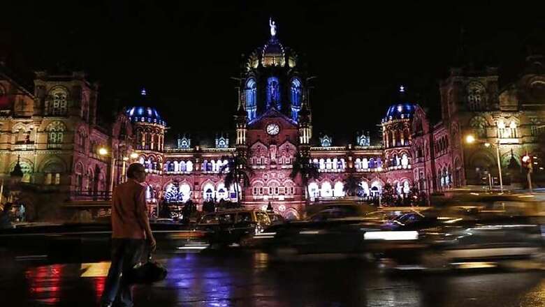
Mumbai: In every part of Mumbai, alongside the bustling markets, moving crowds, cramped restaurants, noisy railway stations and stagnant traffic, there exists a silent world of written words and signs — the names of stores and restaurants perched on their entry gates, directions on roads and public transport, writings on tickets, and names of buildings written in front of them. In a sea of moving vehicles and people, it may be easy to pay no or little attention to these writings or typography but without them, the city will quickly slip into a state of chaos.
Imagine a day in any railway station of Mumbai without the signboards and those perched plaques showing directions and you will understand how incredibly hard it would be for millions to navigate. Yet, it isn't just their usefulness that makes these typographies such an integral part of the city. The typography of Mumbai also contributes to its rich design heritage and lends the maximum city with a unique charm that isn't found in any other Indian cities.
In an ongoing art exhibition titled 'The Typography of Bombay Mumbai' spread across three locations in the city — The Army and Navy Foyer, The David Sassoon Library and Filter, Kala Ghoda — 16 graphic designers of India have come together to pay tribute to this uniqueness of Mumbai's typography, which is a big part of its identity. The exhibition has been curated by Alok Nanda, the owner of the advertising and design firm Alok Nanda & Company (ANC) and it is a part of the Kala Ghoda Arts Festival.
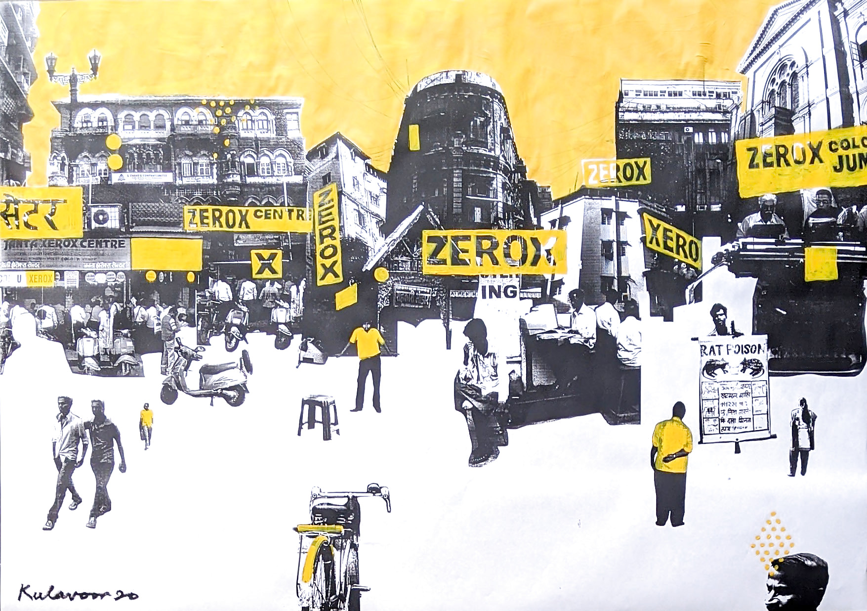
Alok Nanda, curator of the exhibition titled 'The Typography of Bombay Mumbai' says people have a mental associations of certain typography with a certain place, for instance xerox shops.
In an interview to News18.com, Nanda revealed that one of the most distinctive features of Mumbai's typography is the railway platform signage. "They use Latin and Devnagiri for it," said Nanda, adding that because they are often hand-painted, it is hard to connect them back to an individual font.
The heritage district of South Mumbai also has an instant connection to Art Deco typography. "The largest art deco district is on Marine Drive and opposite the Oval Maidan. In fact, this district is the second-largest art deco district in the world after Miami. It has an amazing number of Art Deco fonts," said Nanda.
Much like its unplanned architecture, most of Mumbai's typography, barring the art deco district and railway platforms, is a mishmash of fonts, designs, and lettering written on varied materials. They are often hand-painted and therefore lack in consistency.
"Mumbai city taxi graphics are also distinct in look but there is no consistency of a particular type," said Nanda. "It’s more the graphics created with the type that are instantly recognisable. There are remnants of woodcut shop signs that one sees in the older parts of the city," he added. Most public place signage and writings are in Marathi, Hindi or English in the city.
Nanda said what makes typography even more pertinent is that it subliminally affects your perception of a place or building. "We have mental associations of certain typography with a certain place. Sometimes, it also becomes the recognition of a city. It’s like our xerox shop signs are so distinct and typical of this part of the world — you don’t see them anywhere else,” he added.
As part of this exhibition, each graphic designer has interpreted typography of a specific place, or a thing, and tried to link it to the city's unique heritage. Kudrat Pardiwala, for instance, has intercepted the typography used by Mumbai dabbawalas, while Mahesh Rampuria has analysed the writings on the hall tickets of single-screen theatres of Mumbai. Chandan Mahimkar's work shows popular restaurants' storefront writings and Tushar Kalyankar's art depicts the typography of bus tickets. This exhibition is free and open to the public.







Comments
0 comment