views
Draw a Scatter Plot by Hand
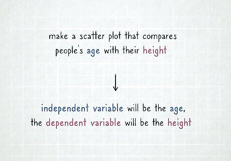
Choose your independent and dependent variables. Most scatter plots will have 2 variables that are used as the 2 axes. The independent variable is the variable that you will be manipulating and changing. The dependent variable is the variable that is changed by the independent variable. Work out which of your 2 variables is the dependent and the independent. A simple way to remember this is that the value of the dependent variable depends on the value of the independent variable. For example, if you were making a scatter plot that compares people’s age with their height, the independent variable will be the age. The dependent variable will be the person’s height, as that’s the variable that will change and vary based on the person’s age.
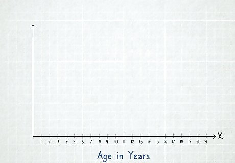
Draw an x-axis for the independent variable. The independent variable is usually placed along the bottom of your scatter plot. This is known as the “x-axis.” Draw a straight line along the bottom of a piece of paper, and mark points along it that cover the range of numbers in your independent variable from the lowest to the highest. If you’re charting age against height, the age of the people you measured would go along the x-axis. If the youngest person you measured was 1 year old, and the oldest person you measure was 20 years old, you’d need 20 points evenly spaced along the line counting from 1 to 20. Use graph paper when drawing a scatter plot to make it easier. Use 1 box on the graph paper for each of the unique results you have in your independent variable. For example, you could draw a line 20 boxes long for a scatter plot comparing age with height of people aged 1 to 20.
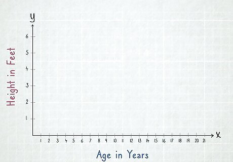
Add a y-axis for the dependent variable. Starting from the left side of your x-axis, draw a line that goes up the side of your paper to make a y-axis for your dependent variable. Mark enough points along the y-axis to cover the range between the lowest and highest numbers you have written down, as you did with the x-axis. For example, a scatter plot comparing age vs. height would have the height on the y-axis. If the shortest person you measured was 1 foot (0.30 m) tall, and the tallest person was 6 feet (1.8 m) tall, you could mark 6 points along the y-axis. Alternately, you could mark 12 points so every second point adds ⁄2 foot (0.15 m). You could also mark a point for every 1 inch (2.5 cm) to make a very large scatter plot. If you’re measuring in centimetres and meters, you could mark a point for every 10 centimetres (3.9 in) of height in the range.
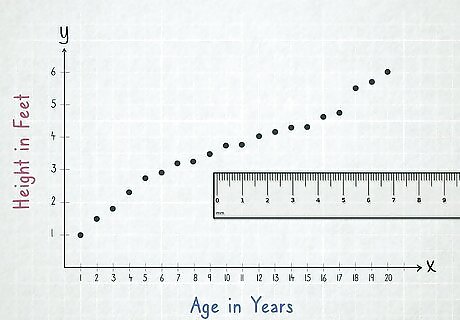
Mark each data point on your scatter plot. Pick 1 pair of independent and dependent variables to start with. Find the location on the x-axis where the independent variable will be, and then move upwards in a straight line until it intersects with the dependent variable on the y-axis. Mark a dot or a cross where the 2 variables meet, and repeat for every variable you’ve collected. Graph paper will make this much easier, as there are already lines drawn on the scatter plot to help you line everything up. Use a ruler, or even 1 ruler along each axis, to make sure your dots are placed perfectly. If you go to mark a point on the scatter plot but there’s already a point there, you can skip it. Alternately, you could add another dot very close to it, or make that dot slightly bigger. If you’re comparing age and height, you could start with someone who is 13 years old and 5 feet (1.5 m) tall. Find the number 13 on the x-axis, and then move upwards until your pencil or pen lines up with the number 5 on the y-axis. Make a mark and repeat with every other data point you have.
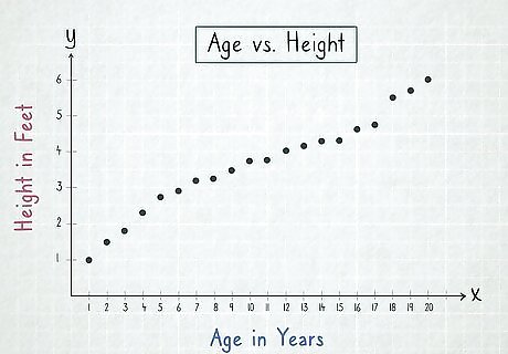
Label your graph and your axes. Once you have all of your variables marked on the scatter plot, you need to label it so you know what’s being graphed. Write a label under each of your axes that indicates what it is they represent. Give your graph a title that explains the 2 variables it is comparing. For a scatter plot comparing age vs. height, you could label the x-axis "Age in Years" and the y-axis "Height in Feet." The graph could be titled "Age vs. Height." If you don’t know what to call your scatter plot, labeling it “[X-axis label] vs. [Y-axis label]” is almost always acceptable. Use coloring pencils, different colored pens, or anything else you have to make your scatter plot look more interesting. Make sure that you can still see all of the information you have marked down though!
Generating a Scatter Plot from a Spreadsheet
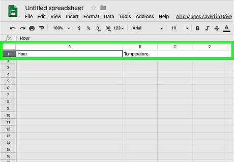
Pick your independent and dependent variables. The independent variable is the variable that remains constant, where the dependent variable will change depending on the independent variable. Work out which of your 2 variables is the dependent and the independent. For example, if you're comparing temperature with the time of day it is, the hour of the day would be the independent variable, and the temperature would be the dependent variable.
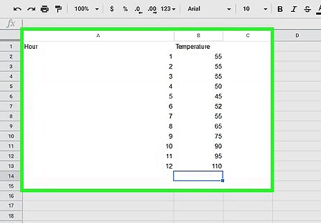
Input the variables into your spreadsheet. In a cell in the top corner of your spreadsheet, write down the name of your independent variable. Put all of the data you have collected in the column below this title, so that 1 variable is in each cell. Move 1 column to the left and repeat the same process with your dependent variable. Most spreadsheet and graphing programs will expect the independent variable to be in the left column and the dependent variable to be in the right. If your program is different, you may need to edit the scatter plot slightly once it’s generated. If you're comparing temperature with the time of day, you could put 7, 8, 9, 10, and so on down the first column to represent the time of day. Then, input the temperature you recorded in the column beside it. So if it was 55 °F (13 °C) at 7am, you could put 7am in one cell, and 55 in the cell beside it.
Select your data and “insert” a scatter plot in Microsoft Excel. If you are using Microsoft Excel, you’ll need to select the data you want to turn into a scatter plot by clicking and dragging over it. With your data highlighted, click on the “Insert” tab before selecting the button that looks like a scatter plot in the “Charts” section to create a scatter plot from your data. The scatter plot button has 2 axis with dots scattered in between them, and may be the last button in the “Charts” section.
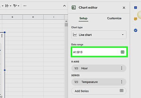
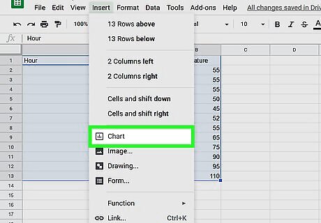
Insert a chart and customize it if you’re using Google Sheets. Click on the “Insert” tab and choose the “Chart” option from the drop-down menu. Change the “Chart type” to a scatter chart, and edit the “Data range” so that it covers the area of your spreadsheet where the data sits. This should create a scatter plot of the data you have input. You can also click on the button made of 9 small boxes that looks like a spreadsheet beside the “Data range” input box. This will let you click and drag over the data you want to use for your scatter plot.
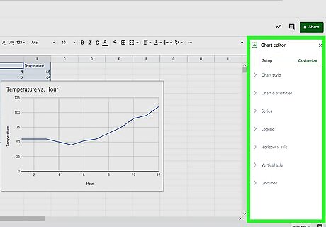
Use the customization options to change the look of your scatter plot. Once you have generated a scatter plot, you can customize it to your own design. Edit the title for your graph, or change the labels on each your axes to make sure they are accurate. Change the color of your graph, the dots, or even the color of the text to make it stand out more. In Excel, you can select the green plus button beside the graph to add more labels and features to the scatter plot. You can also play around in the “Design” and “Format” tabs that appear when you select the graph to change the look of it further. In Google Sheets, you can use the “Chart editor” tab that appears when you insert a chart to edit the look and style of your scatter plot. Use the “Data” tab to edit the data used to make your scatter plot, and use the “Customize” tab to change the way it looks.


Comments
0 comment