views
- Create a graph. Double-click the line you want to graph on the Y-Axis. Click the bar graph icon in the "Format Data Series" window.
- Click the bubble next to "Secondary Axis". This will move the line to the Y-Axis.
- Alternatively, right-click the graph and click "Change Chart Type…". Check the box for each line you want to add to the Y-Axis.
Adding a Second Y-Axis
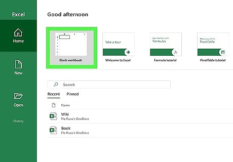
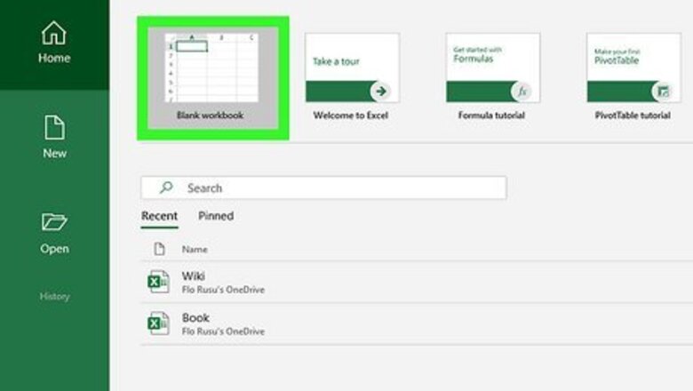
Open a workbook in Microsoft Excel. You can use an existing project or create a new spreadsheet. You can use Excel to make tables, type formulas, and more.
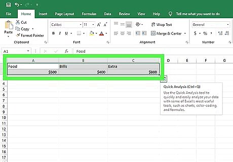
Highlight the data you want to graph. Click and drag over the cells containing the data you want to use in your line graph. If your data isn't already entered, do so now. Be sure to select column headers if you have them. To select everything, click the top-left cell of the data. Press CTRL + A (Windows) or Command + A (Mac).
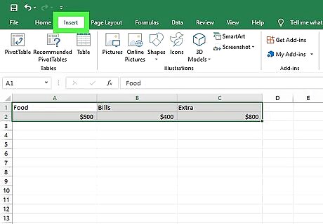
Click the Insert tab. This is at the top toolbar.
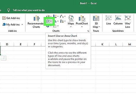
Click the graph icon. This looks like two intersecting line graphs. You can find this in the Charts section.
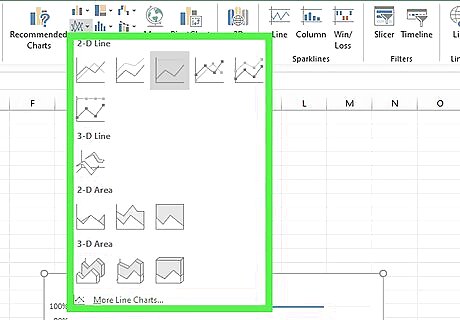
Hover over a graph style. Hover the mouse cursor over a line graph template in the drop-down menu to see what it will look like with your data. The first section of graphs has traditional two-dimensional line graphs, while the second has one or more 3D line graphs. If you have a lot of data, the preview may take a moment to appear.
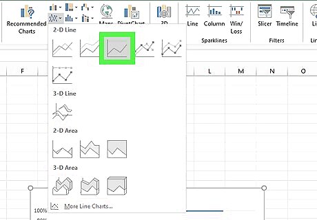
Click a graph style to select it. Once you decide on a line graph template, clicking it will create your graph in the middle of the Excel window.
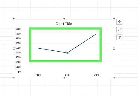
Double-click the line you want to graph on a second axis. Clicking the line once highlights each individual data point on the line. Double-clicking it displays the Format Data Series menu to the right.
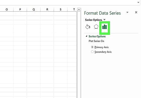
Click the icon that resembles a bar chart. This is the Series Options icon. It's at the top of the Format Data Point menu to the right.
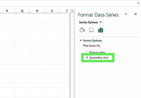
Click the bubble next to "Secondary Axis". It's below the Series Options header in the Format Data Series menu. This immediately displays the line on a secondary axis with the numbers on the right side.
Changing the Chart Type of the Secondary Axis
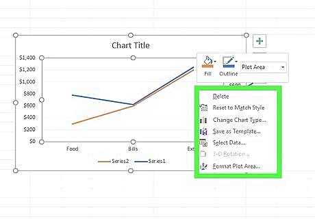
Right-click the chart. If you haven't moved your chart, it should be in the middle of the Excel spreadsheet. This will open a drop-down menu next to the chart. On Mac, you can use a control-click.
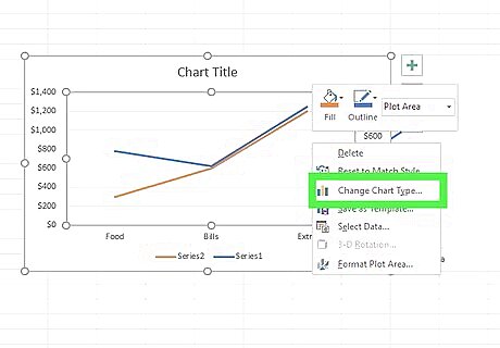
Click Change Chart Type…. A new window will open. If you aren't already on the Combo tab, find it in the left panel and click it.
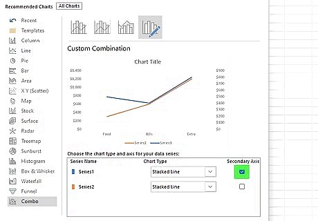
Click the checkbox beside other lines you want to add to the Y-axis. To add other lines to the Y-axis, click the checkbox below Secondary Axis at the bottom half of the window.
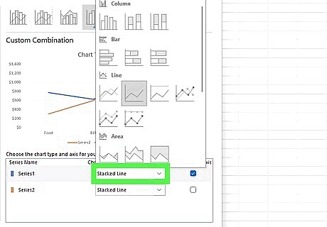
Select the type of chart for each data series. In addition to graphing a data series on a separate Y-axis, you can also graph it on a different chart type. Use the drop-down menu to select the chart type for each data series in the lower-right corner of the window.
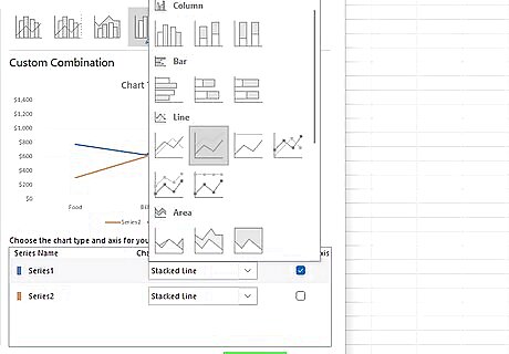
Click OK. This will save and apply the changes you made to the chart. If you want to change the chart type for the entire chart, click the chart type in the menu to the left of the window and then double-click the chart style in the window.


Comments
0 comment